David Hockney design for London Underground savaged by public: ‘‘Like a contest entry from a toddler’
The IndependentSign up to our free IndyArts newsletter for all the latest entertainment news and reviews Sign up to our free IndyArts newsletter Sign up to our free IndyArts newsletter SIGN UP I would like to be emailed about offers, events and updates from The Independent. Read our privacy policy New artwork created by artist David Hockney for the London Underground has drawn the ire of the general public. The design was unveiled by London Mayor Sadiq Khan, and features a modified version of the London Underground logo, designed to deliberately appear as if it were crudely drawn using Microsoft Paint. As seen in the pictures, the A Bigger Splash artist’s design comprises a digital recreation of the London Underground’s signage for Piccadilly Circus, with the letter “s” added at a tangent, as if the artist hadn’t accounted for how much room the word would take up. “Even if we accept it’s meant to be ironic, it’s still awful to look at.” One person described it as looking “like a contest entry from a toddler”, while yet another amusedly accused Hockney of “trolling the world”.
History of this topic
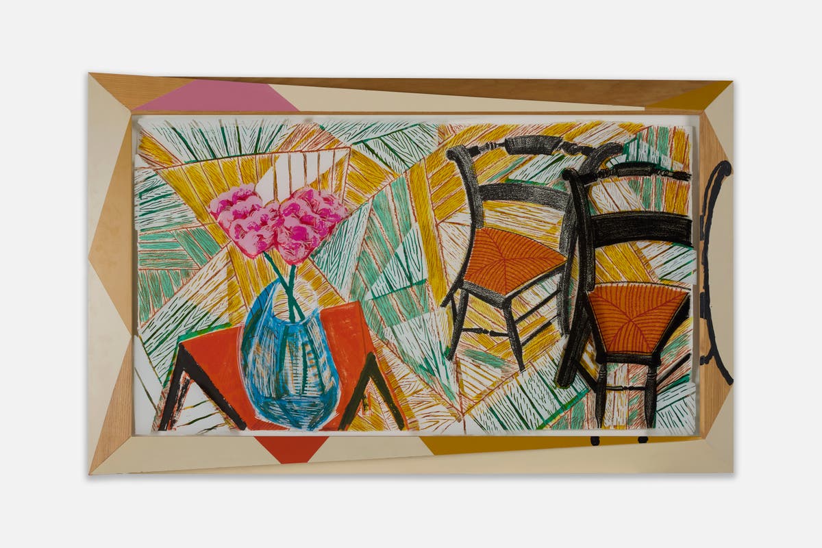
David Hockney exhibition Living in Colour showcasing six decades of iconic work opens in London
The Independent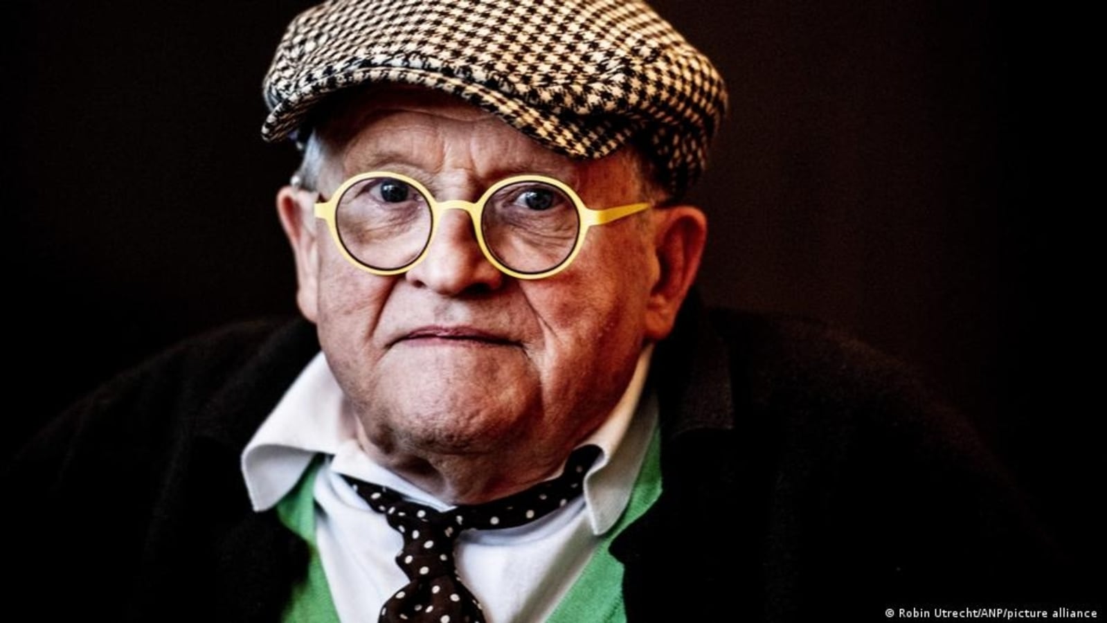
British artist David Hockney at 85
Hindustan TimesDiscover Related


